The Gold Standard: Roundtable Pictures Interviews Legendary Movie Poster Designer Bill Gold
October 26, 2009 § Leave a comment

In a career spanning more than 60 years and more than 2,000 movie poster creations, Gold led the way in how the world sees the movies
Classics include “Casablanca”, “My Fair Lady”, “The Exorcist” and “Unforgiven”
By Lars Trodson
Bill Gold had a dilemma.
The dilemma wasn’t due to the fact that he had a poster to design for a major Clint Eastwood movie that would be released in 1988. He had designed posters for Eastwood before. In fact Gold had designed posters for every Eastwood movie dating back to “Dirty Harry.” The dilemma also wasn’t that he had too few ideas for the poster, or too many.
 The dilemma was this: the poster was for the movie, “Bird”, which Eastwood had directed. It told the story of Charlie Parker — a drug addicted jazz musician. Only the studio, Warner Bros., didn’t really want a poster that suggested that the movie was about a drug addicted jazz musician. That wouldn’t sell to a broad audience. What to do?
What you do is what Bill Gold suggests. His idea prevailed — just as they have during a remarkable career designing movie posters for such diverse directors as Arthur Penn, Alfred Hitchcock, Stanley Kubrick, Sam Peckinpah, Mike Nichols, and Ridley Scott and many, many more. The sheer volume of Gold’s work over 60 years — for movies as diverse as “A Clockwork Orange” to the first theatrical “Get Smart” movie called “The Nude Bomb” — is staggering.
Gold prevailed with the “Bird” poster because he is an artist, and he has good taste. His poster casts Charlie Parker (played by Forrest Whittaker) in silhouette, in the shadows, blowing his sax, with his famous nickname spelled out in glittering showbiz letters. And that is just how Parker lived his life: a music star who also lived his life in the shadows, someone it was hard to see and know.
Also — a beautiful touch — a dove flies away in the corner of the frame. Simple. Elegant. With little text or clutter. Primary colors. All the hallmarks of a classic Bill Gold movie poster.
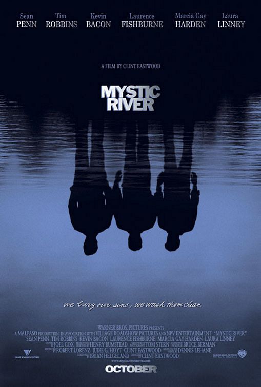 Bill Gold is 88 now, retired to Connecticut, and the last poster he helped design was for Eastwood’s Oscar-winning “Mystic River” in 2003. The first was for “Yankee Doodle Dandy” (1942) — that should give you an idea of the scope of his career.
You probably remember the “Mystic River” image – three men reflected in troubled icy blue water. Three men who were, in truth, very different from the images they presented to the world. The image is mysterious, slightly menacing — just like the movie itself. A perfect match.
 “It’s a good design,” Gold says today, of that work, in his typical understated way.
The “Mystic River” poster is not — just as the “Bird” poster is not — the type of movie poster you see today. A quick tour of the movie section of your local paper will reveal not one poster that you will strike you as a bold visual statement. Today’s posters, at least the ones that end up as the major ad campaigns for a film, are simply a mechanism to convey certain information: who is in the movie, its title, who’s on the soundtrack, and what the critics are saying about it. Sometimes there is an unmemorable tagline. (It’s fun to think what Gold could do for a movie like Ricky Gervais’ “The Invention of Lying,” which boasts a truly atrocious poster.)
What you want out of an ad campaign is to distinguish your product from the rest. But if every movie poster is the same — consisting of photos of movie stars (almost certainly Photoshopped), along with screaming quotes from critics — than every movie also feels the same. And that’s why you’ll get a blank stare if you ask someone which movie won the Academy Award for Best Picture just a few months after the ceremony.
 It wasn’t always so, of course. Classic movie posters are memorable; they are held in as much affection as the movies themselves. When a classic movie is matched by a classic poster — as in “Mystic River” or “The Exorcist” or “The Sting” (all created by Bill Gold Advertising) — you’re held in the thrall of a distinct and pleasurable memory. The poster image becomes part of the movie experience, and is, in the end, another of the reasons why movies are so essential to us.
A movie poster was once the first introduction we’d have to a movie. (Now we hear about a movie through a TV entertainment magazine.) The poster was designed to show the glamour and gloss of the movie, and it added to the feeling that the movie was an event. Posters teased us with some information. Movie stars were drawn and painted, and they were slightly mythologized and also uncompromisingly beautiful. These posters did something for us: they merged perfectly the myth and the reality of the movies.
If you remember the poster from 1942’s “Casablanca” — which was the second poster Gold designed for Warner Bros. — you’ll recognize that poster and movie are essential to each other. The images of Humphrey Bogart, Ingrid Bergman and Paul Henreid are stoic, heroic images — just as we want them to be.
This approach to illustrating not only the truth but also emotion had a prominent place in American culture.
The popular illustrators of the 20th century directly influenced the style and feel of American life. Gold was born in 1921, a time when magazines and books relied heavily on graphic artists to help dramatize their content.
Although photography had been around for 60 or more years, it was only beginning to come into its own as an art form. We tend to forget, because we have all seen photos beginning from the Civil War (photographs today that are considered art) that the medium was used primarily for photojournalism. Photographs were evidence that something actually happened — an idea that might rapidly become outdated. Models in magazines were painted and drawn, as were the illustrations used for advertisements.
The best illustrators were therefore in demand, and they shaped how we perceived American life. In the early to mid-20th century, these illustrators included Maxfield Parrish, Charles Dana Gibson, J.C. Leydendecker, James Montgomery Flagg, J.C. Wyeth and Norman Rockwell. They drew for magazines, created military posters, illustrated books — and created movie posters. They helped create the myth and the reality of an entire country.
And there are others, such as René Robert Bouche, whose name you may not know but whose work, if you are of a certain age, you almost definitely saw in any number of popular publications in the mid-20th century.
As powerful as these images were, magazines and books were still, largely, domestic products. A bookcover for an American version of a novel was almost certainly not used for a translation. As Bill Gold stepped into the offices of the Warner Bros. art department in the early 1940s, American movies were about to go global. So, when the work of the best illustrators were put to work for so powerful a medium as the movies, the combination could not help but have a lasting impact.
The influence American movies had on a worldwide scale, on style, on culture, and even on the future of movies themselves, cannot be underestimated.
And Bill Gold, armed with talent to burn, was about to begin a career that would help make all that happen.
The Start
Bill Gold is a New Yorker. He was born in Brooklyn, and his voice is still inflected with the cadence and pronunciation you associate with that borough. You can hear old New York in that voice. He grew up on Ocean Avenue, a street lined with small, neat houses and apartment buildings, at a time when New York was still very much a movie-making capital. Production hadn’t entirely moved out west, and the major movie studios had their business headquarters in the city.
He was not yet 10 when he realized he could draw.
“I first wanted to draw when I was about eight years old,” Gold says today in his comfortable home in Connecticut. He has lived here the past few years with his wife, Susan, and the walls are decorated with artwork that both Bill Gold and his wife have created.
The artwork in his home reflects almost every medium: still life, pen and ink, oils, landscapes, photographs, and, of course, movie posters. Susan Gold’s photographs are of quiet, dark and misty seascapes, with moons of color in the background. It is this eclectic background that informed his design sensibility.
“I used to copy things from the newspapers and magazines, especially the ‘Saturday Evening Post.’ I used to copy the covers,” Gold remembers. Asked what he liked to draw,he says: “I liked to draw nude girls.” — to which his wife Susan responds with good humor, “Typical.”
 Gold today can’t recall the first movie poster that registered with him, but he said “I had a cousin that was a movie freak, and we used to go to the movies on Saturday mornings. We’d sit and watch the whole program, which had trailers and comedy serials.”
His parents were quiet about his artistic inclinations.
“They kind of whispered about it when I went to bed” he said. “I’d hear them downstairs with relatives explaining to them that I was very talented. But they didn’t want to say it in front of me because they thought I’d take it too seriously and think that I was better than I was.”
But at school it was a different story.
“When I went to elementary school in Brooklyn I took several art courses, which is something that elementary schools do — they give you art courses as a secondary thing. But I used to do so well in it that they used to put me in front of the class and draw things in front of the students,” he says today. “When I graduated from elementary school I won the medal for best artist.”
In high school, Gold said, “I had been doing a lot of artwork on a lot of projects, the yearbook, for the school. I was well known as The Artist.” After graduating from Tilden High School, Gold went to the prestigious Pratt Institute.
“It was the most famous school for art,” he said of the private school that was founded in 1887. The school has an apt motto for someone like Bill Gold: “Be true to your work, and your work will be true to you.”
“I basically studied advertising art, and also lettering, and layout and design and illustration. all phases of Art,” he said of the experience at Pratt. “I wanted to study all those things because I thought it was important in order to become an artist and give instruction to people you would have to have experience in all of those things — photography and illustration and lettering and all the facets of art,” he says today.
All of this was important training. After Pratt, and armed with a portfolio, Gold went over to the Warner Bros. poster department that was located in New York City. The art director was Joseph Tisman, who had helped steer the designs of posters for such movies as “Jezebel” (1938, with Bette Davis).
Gold admits that his desire to create movie posters was unusual — but he was also being true to the direction that he had learned at Pratt: be true to your work. Gold was also practical about why he decided to go into this specific field. “I knew there was a poster department and it seemed obvious that someone had to be doing them,” he said.
He walked into the art department, which, Gold said, had seven people working in it. This included three men solely devoted to lettering. The letterers, said Gold, had a background in sign painting, so their lettering was clear and bold and true.
That Gold walked into the poster department of Warner Bros. seems fortuitous. Please allow us an analogy: If studios were New York City boroughs, then Manhattan, with its glamour and glitz and color, would be MGM, and Brooklyn, where Gold was born, would have been Warner’s.
MGM was known for its spectaculars and musicals — they had more stars than in heaven — and Manhattan had Broadway and Tin Pan Alley. Warner’s was all about gangsters and gritty realism and having a social conscience — three things easily found in Brooklyn.
Gold not only had the training, the natural talent, but he also had the temperament to create the right kind of look for Warner’s’ socially conscious pictures.
 Tisman, the head of the poster department, gave Gold three movies from which to draw some spec drawings. They were “The Adventures of Robin Hood”, “Winter Meeting” and “Escape Me Never” which weren’t on the release schedule at the time(“Robin Hood” had in fact already been released) but would be re-released in later years.
Gold produced three elegant treatments, and Tisman welcomed Gold to start his apprenticeship.
Gold’s first credited poster was for “Yankee Doodle Dandy” — which James Cagney won an Oscar for in 1942. The second was for “Casablanca.” No one can underestimate the impact of both movies. John Farr, writing for The Huffington Post, recently argued that “Casablanca” was the greatest movie ever made. Over “Citizen Kane.”
Both “Yankee Doodle Dandy” and “Casablanca” were directed by Hungarian-born Michael Curtiz. Curtiz was to 1942 what Victor Fleming was to 1939. Fleming directed both “Gone With The Wind” and “The Wizard of Oz” that year.
The two 1942 films directed by Curtiz were nominated for a total of 17 Academy Awards. Both were nominated for Best Picture and Best Director. Both Cagney and Humphrey Bogart were nominated for Best Actor. Both were nominated in the writing category. Both films were instrumental in bolstering the country’s mood in wartime.
There was a lot riding on these two pictures for Warner’s. The posters also had to deliver.
Gold was charged with creating the posters. These movies were designed not only to entertain audiences but to inspire a frightened and besieged American audience. The posters had to do the same.
The poster for “Yankee Doodle Dandy” is clear-cut patriotism: bright colors, a red, white and blue palette, a saluting Cagney (as George M. Cohan) — the American flag with stars that are fairly bursting like fireworks. If you saw that poster in a frame at your local theater even before the movie was released, you’d know exactly what to expect: bright, spangled, lively entertainment. You didn’t need a critic’s blurb to tell you what to expect.
“Casablanca” was a little more complicated. It was the first, and maybe the only, patriotic film noir. There are shadows in this picture, just as there were shadows in “Bird” — but the difference was this: “Bird” had to capture the mood of a movie, “Casablanca” had to capture the mood of an entire country.
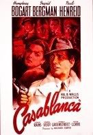 In the “Casablanca” poster, Bogart takes center stage. He’s wearing a fedora and a trenchcoat — and no actor, not even Robert Mitchum — wore a trenchcoat better than Bogart. The upper half of Bogart’s face is covered in shadow. He is poised with a pistol in his right hand, facing the enemies of America.
There is another tricky part. You have three big stars — Bogart, Ingrid Bergman and Paul Henried — but also a host of lesser stars, all of whom are essential to the story and the film. How do you fit them in?
Today, you would employ what Gold calls the “Mount Rushmore Effect.” That is, you would simply put the photos of the major stars in a lineup on the poster and be done with it. When you employ that effect, you certainly know who stars in the movie, but little else.
But in 1942, it was the illustrator who was charged with achieving the perfect alchemy of emotion and realism. With Bogart in the forefront and the rest of the cast in relief, shadowed behind a blood red color, you get the sense of intrigue, romance and drama.
It was a brilliant choice, and only the hint of what was to come in the next 60 years and 2,000 or more posters.
The Process
“If the movie hasn’t been shot yet,” said Bill Gold, “then we ask for a script. We see the movie, or read the script, and then we start to throw out ideas.”
So goes the creative process to come up with an idea that a studio thinks will help sell the movie.
It is a high-pressure, and almost assuredly thankless job. Gold says the axiom regarding the worth of a poster in relation to the success of the film is precisely this: “If the movie is a hit, then it’s because of the movie. If it fails, then it’s the marketing.”
Movies take months, if not years, to create (and they should). With a poster you’ve got 4-6 weeks. It’s not a lot of time to think, and you have to get it right.
So, when the time was crucial to get it right, sometimes the movie studios were lucky to have Bill Gold.
Alfred Hitchcock is regarded by many critics as the greatest filmmaker that ever lived, and even if he is, he had two fallow periods of creativity. The first hit in the late 1940s, when he made, in succession, “The Paradine Case”, “Rope”, “Under Capricorn” and “I Confess.” None of them make the top 10 list of Hitchcock films, although “Rope” is a genuine curio.
The second dull period came in the mid-1960s, when he released three desultory films in a row: “Marnie”, “Torn Curtain” and “Topaz.” The latter two are especially puzzling.
But Hitchcock always rebounded in spectacular fashion. After “Topaz” he went to England and shot “Frenzy.” And earlier, in 1951, he made the sublime “Strangers On A Train” that got out him out of his funk.
The latter was a Warner’s picture, so the design of the poster fell to Bill Gold. One of his other posters for that year was for “A Streetcar Named Desire.” Gold wisely emphasized the marquee names associated with that picture — one of which was Marlon Brando and the other was the name of the film itself, which had taken Broadway by storm and was justly famous. Gold made a compelling poster — but in large part because he did not let ego get in the way. Gold allowed the product do the talking. Sometimes that is the smartest move, and it takes an artist to know that.
But “Strangers On A Train” was an altogether different animal. Sure, it was Hitchcock, and if it sported movie stars they weren’t major ones (Robert Walker, Ruth Roman and Farley Granger). The story was adapted from a Patricia Highsmith novel (she created “The Talented Mr. Ripley”), and it had a distinct homoerotic undertone.
The poster for this would have to be complex, and make the case for why you would want to see this film. As we said, Hitchcock was coming off a slate of mediocre films, so there was no doubt there was some anxiety: this movie had to be a hit.
 Gold’s poster is all jangled energy, sharp angles and physical jolts. The locomotive is coming in screaming from the left, and the tracks cut across to the right behind an anxious-looking, and smoking, Farley Granger. It’s an odd effect — the train and the tracks seemingly coming at each other. Gold put the title of the movie on signposts, and that decision adds drama to the title. Gold also cut the poster in half. The top half is gold, the lower half in white. There’s an image of the creepy Bruno Anthony (Walker) alone, and one of his strangling a girl (played by Hitchcock’s daughter Patricia) and another of Granger in a clinch with Ruth Roman.
It’s geometric, precise, and taken in the long view lets the viewer know exactly one thing: they’re in for a wild ride. The poster has zip and pizazz. It is 180 degrees opposite of the steamy languor of the “Streetcar” poster. Even if the poster didn’t get the credit, “Strangers On a Train” was a hit.
By this time, 1951, Gold had been head of the Warner’s poster department for four years. He would stay in that position for another eight years.
The dozen years Gold was head of the department were perhaps, up until now, the most tumultuous in the history of Hollywood. The spectacular hold the movies had on the public was loosening by then — television was taking audience. Movies were morphing from backlot productions into Technicolor, widescreen, shot-on-location extravaganzas. Movies were once intimate, and now they wanted to embrace the entire scope of history. Everything, including the comedies, got big.
 The movies Gold helped sell to the public during that time include: “Dial M For Murder”, “East of Eden”, “Mister Roberts”, “The Silver Chalice”, “The Lone Ranger”, “Moby Dick”, “The Searchers”, “The Wrong Man”, “A Face In the Crowd”, “The Pajama Game”, “The Prince and the Show Girl”, and “The Old Man and the Sea.”
This put Gold in close proximity to the work of John Ford, John Huston, Laurence Olivier, Elia Kazan and such journeymen as Victor Saville. It offered Gold the opportunity to create a poster for a movie some people consider one of the greatest ever made (“The Searchers”, 1956). He had to draw the likeness of everyone from Andy Griffith to Marilyn Monroe.
 The poster for 1955’s “Giant” is simply terrific. Gold took a motif — bigness — and applied it directly to the movie stars themselves. Rock Hudson, Elizabeth Taylor and James Dean tower above everything in this poster. They each look like the embodiment of Texas, and the word “giant” is spelled vertically over a setting Texas sun.
The choice of the setting southern sun is especially acute. Although the story is a sprawling, brawling epic, it’s also about the end of an era in the Lone Star State. The image, appropriately, does not overwhelm the images of the stars, but it adds a note of poignancy the image needs.
To create work like this is precisely the difference between being holistically trained in the graphic arts and being trained simply in Photoshop.
Gold left Warner’s in 1959 to start BG Charles with his brother, Charlie. Bill concentrated on posters, and Charlie on movie trailers.
“Warner’s wanted to give up their New York offices and all their executive personnel were being shipped to the coast,” said Gold. “They asked me if I would make the move and they would then guarantee me the Warner’s account. I agreed.”
Like all the best artists, Gold didn’t peak when he was young. He had been designing posters for 25 years when he took all that experience, all that training, and began his most impressive period of work. In 1962, Gold went back to New York and started Bill Gold Advertising.
The 1970’s, especially, were to be spectacularly prolific and successful, and at the beginning of that decade Gold also began the most complete and symbiotic partnership of his career with Clint Eastwood.
The 1970’s and Beyond
It takes less than a few minutes to walk into a movie store to find a knockoff of a Bill Gold movie poster.
 Right there, on the shelves, are two: for two instantly forgettable titles called “Corporate Affairs” and “Pigs.” It takes only a second to realize you’ve seen the image from these posters, and you have. They’re copies of Gold’s famous poster for the 1981 James Bond film “For Your Eyes Only.” (An early echo of this pose can be seen in Gold’s poster for “Damn Yankees” — Gold tells the story about how the Bond image, which caused a bit of a stir in 1981, came about.
“We made a sketch and showed it to the producers, and then we hired a leg model, someone who does only legs and arms,” Gold said. “We had her pose with her bikini bottom on.”
Something about the image wasn’t quite right, however. “It wasn’t provocative enough,” said Gold, “So we asked her to put her bikini  bottoms on backwards” – that is, the front of the bikini was now in the back. It was just the right touch. The poster has sex appeal, menace (the model happens to be carrying a crossbow), and Roger Moore as Bond.
The poster became an instant classic.
It was a good way to start off a new decade, because the 1980s were going to be a hard act for Gold to follow.
Exactly 10 years prior to the Bond poster, things were humming along at Bill Gold Advertising. Posters for projects as diverse as David Lean’s “Ryan’s Daughter” to the Peter Seller’s romp “There’s a Girl In My Soup” were coming in steadily.
But in 1971, Gold took aim on Stanley Kubrick’s “A Clockwork Orange” and Don Siegel’s “Dirty Harry.” Both films have been celebrated and reviled. Both are landmarks in cinematic violence. Both are considered high points in a period of cinematic creativity and freedom.
But they also couldn’t be more different, and the posters Gold designed for them reflect that.
Kubrick was fully into his chilly formalist mode when he chose to adapt Anthony Burgess’s novella for the screen. Burgess had created a wholly realized future in his book, in part by designing a language, nadsat, which was described in the book as “Odd bits of old rhyming slang…A bit of gypsy talk, too. But most of the roots are Slav. Propaganda. Subliminal penetration.”
Anyway, it’s strange and compelling, as is the lead character Alex. The movie is harsh — there is nothing soft or subtle about it. It’s shot either in darkness or in rooms that look like they have been flooded with fluorescent lights. It’s unpleasant.
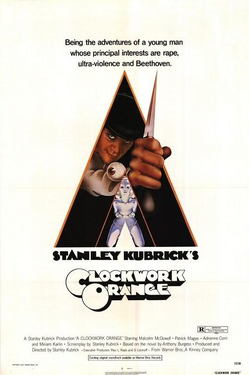 Gold’s poster reflects that. There’s no softness. At the center is a jagged pyramid jutting upward (which doubles for the “A” in the title), with a spiky knife, also thrust upward coming right out of it. The knife is held in Alex’s hand and Alex’s evilly impish face also pokes out of the shape, and we see that his shirtsleeve has an eyeball stitched to the cuff.
Below Alex is one of the plastic fountains from the Korova milk bar where the boys go to drink their “milk plus”, which adds to the aura of inhumanity and futurism so central to the movie.
Equally as famous is the font chosen to write out the title, which is called ‘Timepiece’ and helped add immeasurably to the feeling that audiences were about to enter a cruelly inhuman world in “A Clockwork Orange.”
Harry Callahan was an altogether different kind of hero than Alex. Feet firmly planted in the present day, Callahan has a sense of violence that can be seen as the proper reaction to a world seemingly gone mad.
 Callahan is Dirty Harry, of course, so named because he’ll do “any dirty job that comes his way.” He’s a violent, cynical guy. “Detective Harry Callahan. He doesn’t solve murder cases. He smashes them” is the tagline. In the poster, this tagline is written inside the hole where a bullet has been shot through glass, and Eastwood’s glowering face peers out from the background, his famous .44 Magnum pointing right at the viewer.
In these designs, there are stylistic similarities to the outlooks of both the droog (famous nadsat word for “friend”) Alex and the cop Harry, but in the end they couldn’t be more different. The graphic design choices made by Gold lets the viewer know precisely the differences in the cinematic the viewer is about to experience.
Gold worked for Kubrick one more time, for 1975’s “Barry Lyndon.”
“I’d fly back and forth to England to show Kubrick the designs. He was very smart. He wanted to have his hand in everything” said Gold. “He called me every morning to tell me what he wanted to change (on the poster).”
 In 1973, Bill Gold Advertising designed the famous poster for “The Sting.” While it may seem obvious to some that Gold would choose a design and font that mimicked the style of the illustrators of the 1930s (the era in which the movie takes place), but it isn’t really that simple. If you look at the poster for “Barry Lyndon” the choice of font and colors could easily be describing a 1970s love story. That’s because Kubrick (for the first time) employed some modern cinematic techniques to film this 18th century tale.
“The Sting”, however, was altogether old-fashioned. Director George Roy Hill even opted to be the opposite of Kubrick by utilizing editing techniques that were in vogue in the thirties but had long since fallen out of style by the 1970s. So Gold took that approach.
To create the desired effect, Gold reached right back to one of his original influences, Saturday Evening Post illustrator J.C. Leydendecker. The poster employs Leydendecker’s once-famous style, including a large, Art Deco disc for graphic effect in the background, and a voluptuous treatment of fabric and faces. The highly stylized images of Paul Newman and Robert Redford is almost as famous as the film.
It is also a great example of something so crucial to so many Bill Gold posters. His images not only had style and taste, they had wit. (As an example of wit, take a look at the “Funny Girl” poster from 1968.)
The Eastwood Period
You can’t please everyone.
In 1972, Gold designed the poster for “Lady Sings the Blues”, Sidney J. Furie’s look at the Billie Holiday story that starred a magnificent Diana Ross. The poster is instantly recognizable, but the image did not initially please Miss Ross, according to Gold. In the poster, a slender arm reaches up to hold a microphone, yet wrapped around the wrist of the extended arm is a pair of handcuffs. Holiday was chained to two things: her music and drugs. The image is also covertly sexual. Diana Ross may not have cared for it, but the studio did, and so it stayed.
One person who did like what Gold produced was Clint Eastwood.
It becomes more and more difficult to encapsulate Eastwood’s career. He was dismissed early on as a reactionary conservative, a bad actor who made inexplicable chimpanzee movies, and a clumsy director. But those attitudes almost always came from critics. Audiences embraced Eastwood and none other than Orson Welles had high praise for Eastwood’s early directorial effort, “The Outlaw Josey Wales.” Thoughtful moviegoers never bothered to pigeonhole him.
None of that really matters any more, anyway. An Academy Award-winner a few times over now, Eastwood is recognized as a director with an identifiable style and a filmmaker with an artistic eye and a global sensitivity. He’s regarded as both an auteur and a commercial success.
Today, people who love movies have attached themselves to Eastwood — he’s a filmmaker who reminds people how memorable and larger-than-life movies can be. And, to this day, he is rewarding audiences with truly great films, including the sublime “Gran Torino.”
 Eastwood and Gold are one of the great Hollywood teams, if one of the least well known.
“He’s a perfect gentleman. We’re a great match cause he knows what he likes, he has fantastic creative instincts,” said Gold of the relationship. “I know what he likes.”
When Eastwood presented Gold with a Lifetime Key Art Award from the Hollywood Reporter in 1994, he simply called Gold “the greatest.”
Movie posters, like the movies themselves, are a collaboration between other artists. Often the process involves photographers (Gold took many of the photos that served as the basis for his posters), graphic designers, calligraphers, sketch artists. They go through many incarnations and ideas before the poster that hits the right tone is discovered.
But any artistic endeavor first needs a good idea that captures the essence of what you are trying to say.
 The poster Gold designed for Eastwood’s “The Bridges of Madison County” (1995) is an example of how this process works.
The set photographer on this film took a photo one day of Eastwood cradling his six-month old daughter. When Gold happened to see the picture, his immediate reaction was that it was “so beautiful, so tender. Clint loved the tenderness of that shot.”
These are two adjectives — beautiful, tender — that convey the essence of the love story between the Eastwood character, Robert Kincaid, and Meryl Streep, who played the lonely housewife Francesca.
Gold had an idea. “Let’s get Meryl Streep in the same position with the same lighting,” said Gold. A separate photo of Streep was taken, and the result is Eastwood cradling Streep in his arms. It is just the right symbol for this quietly tender motion picture.
The poster for the film seems organic, as though it emerged whole during the making of the film. But it helps to appreciate Gold’s artistry when one realizes that the poster was created after Eastwood was no longer available.
It also captures the philosophy both men have about the artistic process: “Less is more,” said Gold. “That’s Clint’s favorite phrase.”
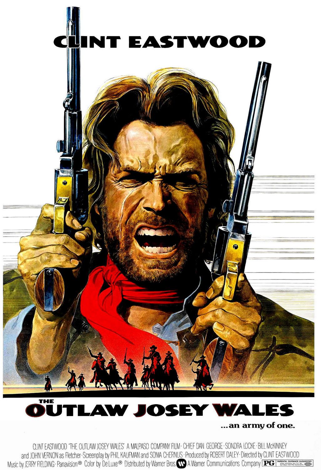 The poster for “The Outlaw Josey Wales” — as effective as it is — contains a physical representation of Eastwood that no one has ever seen — in his movies. The poster shows Eastwood shouting and snarling.
“I said to (my brother) Charlie, we need to get Clint to pose for a shot with two guns right around his face.” Gold told Eastwood that he wanted him “to face the audience as though you are terrified. Clint said, ‘I don’t do that.’,” said Gold. “But he did.”
The emotion on Eastwood’s face is not one he ever shows in “Josey Wales”, but it evokes the rage he, and the audience, feels underneath.
Perhaps the best example of the simple style advocated by Gold and Eastwood can be found in the wordless image Gold fashioned for “Unforgiven” (1992).
 The poster features Eastwood, his back to the audience, his head bowed slightly and turned to the left so we can see the profile. His hands are clasped behind his back holding a pistol. The image is almost in silhouette, but not quite, but it is dark and foreboding.
To create this image, Gold used the tools at his disposal: he took the gun from one photo, the hands from another, and Eastwood’s head from yet another. The end result is seamless, and won Gold some of the most prestigious awards his industry has to offer for that design.
After more than three decades working together, Gold retired after finishing the poster for “Mystic River.” Gold began with Cagney and ended with Sean Penn. Something feels right about that.
Today, movie posters fall into two distinct categories. You find the industrial type (“Law Abiding Citizen”) or the kind that screams “Quirky! Independent!” (“The Year of the Dog” (2007) , or this year’s “Away We Go”). There is little or no nuance.
We may also be living in an unsophisticated time, and that may strike some as counterintuitive, think about it. This is an age in which writing as been reduced to the simple reproduction of sounds and elemental symbols (“R U ;-)?”). Images have to be blunt because otherwise they won’t make an impression.
 Look at the difference between Gold’s poster for “Funny Girl” (1968) and “Couples Retreat” (2009). When looking at the poster for the Barbra Steisand movie you can see it’s light and cute: it makes you smile. In the image for the Vince Vaughn feature, you realize that every person in the image looks glum or angry. This is comedy? Maybe we live in not such a fun time, either. Where’s the wit?
Gold has now retired from making posters, and his retirement may have come at the right time. Whether the art form continues, or is even really necessary in the modern age, remains to be seen. But he misses the work.
“I wish I was still doing it,” he said.
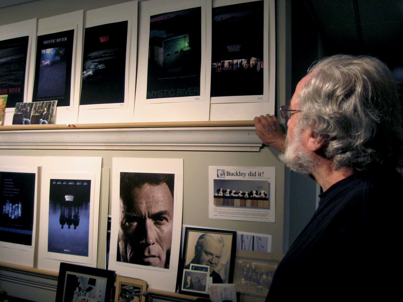
He is retired but not idle. He and his wife Susan are busy compiling a book on his life’s work. It’s not simply a record of the posters he ended up creating, but will be a fascinating look into the artistic process. He has saved many of his sketches, and the book will show how an idea for a poster evolved to its finished state.
He has more than 2,000 of his own images made over 63 years to choose from, after all, many of which helped define the way we feel and think about the movies. His posters have made their way from the initial theatrical release to their latest DVD incarnations to right into our brains. Anyone who would change the poster for “The Exorcist” would have to be nuts.
How to sum up this remarkable career? Bill Gold himself said that when he looks back on it “I can hardly believe it.”
But perhaps it is best to turn to the master of the succinct statement, Clint Eastwood.
In his speech presenting Gold with the Key Art Lifetime Achievement Award, Eastwood expressed a sentiment that applied not only to his own movies, but to the art of creating movie posters in general.
Eastwood said that almost all of the movies he had made since “Dirty Harry” featured a Bill Gold poster.
“The ones that didn’t feature a Bill Gold poster,” Eastwood said, “I regret.”
Websites:
http://en.wikipedia.org/wiki/Bill_Gold
http://web.me.com/go4thegolds/
***
The Original Grindhouse War Movie: Enzo G. Castellari’s ‘Inglorious Bastards’
October 23, 2009 § Leave a comment

By Lars Trodson
The biggest difference between Quentin Tarantino’s movie “Inglourious Basterds” and Enzo G. Castellari’s “The Inglorious Bastards” is not the fact that there is almost no similarity between the stories of the two movies. The real difference is that there is not one sentimental frame in Castellari’s version – human beings are dispatched with remarkable efficiency and frequency with not one iota of regret.
Tanrantino’s film, on the other hand, is steeped in sentimentality — he’s got nostalgia for grindhouse films, the the films of World War II, the old glamour of Hollywood, for the earlier version of the film he remade, for old-time villains and cinematic heroes and for the women who sometimes love them. His “Inglourious Basterds” is really a nostalgia trip.
Castellari’s 1978 film is an opera of carnage. None of the violence is terribly explicit — you won’t find the sickening realism of “Saving Private Ryan” here. But scores and scores and scores of people are killed during 99 minutes, including (spoiler alert!) some of the lead characters. But, honestly, Castellari wasn’t much interested in having you care about these people anyway.
It’s all about the explosions and the gunfire.
Castellari’s film is so defiantly unsentimental that the only character that expresses any criticism of warfare is a German soldier named Adolf Sachs (Raimond Harmstorf) who decides to throw his lot in with the Americans.
Sachs is also at the center of a remarkable, and brutal, misunderstanding that actually sets the plot in motion. This occurs almost halfway through the film. It’s an ingenious twist, and one that would be heartbreaking if Castellari and screenwriters Sandro Continenza and Sergio Grieco gave the audience a second to consider the implications of the event, but they don’t.
The plot is reminiscent of “The Dirty Dozen.” A ragtag group of soldiers who are about to be court martialed are being transported to either prison or the gallows. But unlike “The Dirty Dozen” they aren’t recruited for a mission that would, if completed, gain them salvation. Their convoy is attacked by the Germans on the way to the clink and everyone guarding them is killed. The bad-boy soldiers escape and they take it upon themselves to join the war again.
Their ultimate challenge comes about solely due to the turnabout with Sachs, the German soldier that was captured by the Americans and who joined their group.
 The film isn’t as delirious as one would hope it to be. It’s a fairly conventional actioner, with few of the lurid touches you’d get in a real whacked out European film by someone like Jesus Franco. The cinematography (by Giovanni Bergamini) is solid, and the acting is uniformly lacking. It’s shot in the typical way of a film that was always meant to be dubbed, with the camera moving away from faces as they speak so the audience wouldn’t get too caught up in the idea that the mouth wasn’t forming the words you actually hear.
The only adjective I can find for the special effects is “cute” — the destroyed buildings and bridges and trains are straight out of tiny-town — miniature recreations that look small despite the best effort to disguise them. But the production also features real tanks and trains and jeeps, which is nice and retro.
There is also a very mini Steve McQueen-like motorcycle jump that is, well, cute.
 The climax features a runaway train and a secret German weapon that must be deactivated. None of the plans laid out by the Bastards goes particularly well.
The cast includes the rock-like Bo Svenson, Fred Williamson and an actor named Peter Hooten who supplies, improbably, the only love interest the film has.
A genuine curiosity is the Americanized name of the film. In one of the odd and mysterious ways that language sometimes works, the two perjorative words in the title — “inglorious” and “bastards” — somehow, when taken together, conjure up an image of heroism, which is exactly what the film meant to convey. That may be coolest thing about it.
The Ken Burns Effect: Can’t We Get a Joke Once In A While?
October 4, 2009 § Leave a comment

By Lars Trodson
I tried. I really, really tried to watch Ken Burns’ latest documentary on PBS. But I can’t. I’m all for being serious, but over 12 hours I need to laugh — I’ll even take a chuckle — once in a while.
Ken Burns is a beautiful filmmaker and an undeniably articulate writer. There’s no question. But ever since I was introduced to him through “The Civil War” series years ago, and then through “Baseball”, and “Jazz” (and others) and now with “The National Parks: America’s Best Idea”, I have more frequently begun to ask myself why the guy has to take everything so seriously. Not everything in life is weighted with meaning and metaphor and deep insight into the human condition.
I understand completely that there is nothing funny about war, which Burns has examined twice, but — and thank goodness for it — funny things do happen in wartime. Even when life seems to be crushingly horrific, funny things can happen. But not in a Ken Burns documentary.
I happen to think baseball is one of the most whimsical and fleet-footed of all games, but not according to Burns. It was only frought with money and race and labor issues. I loved a lot of that series, but I thought: Couldn’t he have devoted a half hour one night to some funny stuff?
How about jazz? Jazz can be humorous, lyrical, light – but can you name me three moments of downright laugh out loud moments in Burns’ “Jazz?” Why not? Has nothing funny happened in the jazz world in the past 90 years? Was Jack Johnson’s life all misery and pain and controversy?
 I’m not sure that the National Parks systems is the best subject to begin turning on the laughtrack, but there must be something in that history to lighten the load. I’m going to give the series another go, and maybe I’m wrong. But so far it has been the same approach as before — stunningly beautiful pictures and archival footage, voiceover narration by Tom Hanks, and the plink-plink of folk music in the background as we are tutored. So I’m having a hard time of it.
Ken Burns is almost certainly on to another project. I applaud him, and look forward to whatever he has to say next. But as he’s writing his next script, I only ask him to take a moment and try to give his audience a break from the sobriety of life, and remember that there can be a telling detail about America and her history wrapped inside a good old-fashioned joke.
Is Godard’s "Contempt" Relevant Today? Is Godard?
October 2, 2009 § Leave a comment

By Lars Trodson
In the 30-minute discussion that takes place at the heart of Jean-Luc Godard’s “Contempt“, the characters played by Michel Piccoli and Brigitte Bardot talk about the following:
 The future, the past, love, the meaning of love, sex, art, sex in art, family, lying, money, commerce, happiness, fame, contentment, dinner, appearances, illusion, reality, jealousy, truth, infidelity, movies, career, marriage, divorce, sanity, insanity — and perception.
At one moment, Piccoli — who plays a screenwriter — slaps Bardot (she plays a typist) – so there is violence, too.
In other words, just about every subject the movies have ever tackled is presented in one circular, fascinating and maddening discussion by two unhappy people.
It’s fitting, because no doubt Godard thought of his film as a kind of coda. He was summing up. At the end of the film, Godard has the words “Take Care” and “Farewell” (adieu) written across the screen, and almost certainly these words were being spoken by Godard to the essence of film — a message to cinema itself — rather than to the characters in the movie that were about to die.
Godard’s film is literally about the death of cinema, a curious approach considering the man is still making films almost 50 years later. Maybe “Contempt” — the French title is “Le mepris” — was all a lark. I suppose in my younger years I would have fallen in love with this conceit — the romanticism and the purity of it. Godard would be right because he is a genius. That is the romance of the young. We must all die before we get old and corrupt.
But such concessions don’t come so easily any more — if only because enjoyment from the movies comes in so many forms, including the commercial and the ludicrous.
 Godard’s movie, released in 1963, is based on the premise that the movies had promised us something — that they started pure and somehow lost their way. Who were these owners of early cinema that sold it to the bankers and the bean counters? There isn’t anything in the historical record to support that. We can appreciate and even admire the earliest film shot by Edison, or the Lumieres or Georges Melies. The films are simple and certainly beautiful, but that doesn’t mean their only reason for existing was as art. No — these were businessmen, too. It is a self-reverential and a certain kind of mythologizing to say that commercialism wrecked the movies. This is a platform supported by movie reviewers who see 200 movies a year and never pay for a single one. They have time to consider such abstract arguments. The rest of us, we pay our ten bucks and want to be entertained.
I’ll be more honest than the critics who say that “Contempt” is a masterpiece. That most of the reviews of the movie mention how long that middle scene lasts, just as I did, means that at some point they looked at their watch as the thing played out. I did.
Since the 1960s Godard has been arguing that cinema was coming to an end, and by the time “Weekend” rolled around in 1967, he was giving way to any sense of formalism or rules. More recently, he has been shooting digitally and his films receive a limited release, at least outside Europe. They seem to be very personal endeavors, which is fitting. I haven’t seen them.
He may have been, and may be continuing to be, fighting against American capitalism, and if that’s his battle, fine. But what, really, is the battle Godard is fighting in “Contempt”? The same fight Peckinpah fought? And Welles? The one against the philistines with the check? Perhaps — but if you have a grand vision, and Godard certainly had one, no one has yet figured out how to film that for free. Particularly if you put movie stars in your movies, which Godard was wont to do. This is rebellion?
Maybe in the last 40 years Godard has put his own money into his pictures, and then it would be hard to argue the point. He can do whatever he wants. But with “Contempt” it seems like a peculiar argument. What does it mean to take a check from producer Joe Levine, and then make a movie contemptuous of the check from a guy like Joe Levine?
Everybody — including the gods that the characters in “Contempt” rail against — has a boss. This includes filmmakers. If you don’t like it, go stick a camera on a tripod, film yourself musing in a chair, and post it on YouTube.
 From what I understand, “Contempt” starts out with a scene of Bardot nude in a bed because Levine wanted the great BB in the nude. Godard, who could rise to a challenge when he felt like it, turned the scene into something both sensual and contemplative. Bardot asks Picolli questions about her body, and how her husband likes specific bodily parts. After she asks about her kneecaps and breasts, Piccoli says:
“I love you totally, tenderly, tragically.” Piccoli, who plays a screenwriter Paul Javal, could very well be talking about the movies, and in this movie in particular.
The scene then jumps to a decrepit movie studio where the crass, manipulative movie producer Jerry Prokosch (Jack Palance) comes out of a door and says, “Only yesterday there were kings here! Real human beings!” And he is referring to the gladiator epics that were made at the Cinecitta studio in the late 1950s and early 60s, when Italian cinema was in decline, but Godard may also be referring to the ghosts of the filmmakers who have come before.
Later, as Prokosch watches in dismay the dailies from the film version of Homer’s “Odyssey” that he is producing with Fritz Lang as director, he says, “I like gods. I like them very much.” But he hates the film he is producing, and yet he writes another check, almost as though he is a slave to the art he is trying in vain to protest.
To help punch up the project, Prokosch tries to hire Javal, but Javal is ambivalent. Prokosch invites everyone back to his villa for a drink after the screening. Lang says “Include me out” — resurrecting the famous line by Samuel Goldwyn. Their initial discussions at the villa, and the perceived liaison that Javal has with Prokosch’s assistant (Giorgia Moll), leads to the discussion at the middle of the film between Bardot and Piccoli.
Bardot’s appearance in the film seems to lay somewhere in the twilight between commerce and art. She is named Camille, after one of the most famous French characters in literature. The original Camille (which was written by Dumas fils) must choose tragically between love and obligation, even as she is dying.
 Bardot — who turned 75 on Sept. 28 — had a reputation of living exactly as she pleased. Not only was she obviously beautiful, she was a free spirit, and came to physically embody the national symbol of France. The idea that Bardot was in any way a Camille-like character was silly, and maybe that was the joke. Maybe.
In the sequence in their apartment, as Javal and Camille muse about the various aspects of life, Bardot dons a black wig, an act reminiscent of Welles cutting off Rita Hayworth’s long red hair for “The Lady From Shanghai.” The conversation they have — even though it is archetypal – can be fun and inventive.
“Why so thoughtful?” Javal asks Camille at one point.
“Because I’m thinking of something,” she responds.
But Camille’s dilemma is simply personal. While it may be important to her, the only aspect of her life we are exposed to is her marriage to Javal. The problems the marriage is undergoing are only alluded to, and so we’re not terribly invested in them. There’s nothing more important than that, and so the conflict, if one even wants to call it that, is mild.
That Godard made the decision to spend so much time with these two shallow people — as opposed to Prokasch and Fritz Lang, who seem to have so much to say — means that Godard ultimately made the decision to make an intellectual point with his film rather than make any attempt to move his audience emotionally. He later took this attitude to near perfection in “La Chinois”, which is almost all treatise and no cinema — outside of his devotion to bold color schemes.
If I want to be indoctrinated, maybe I’d be better off forgoing the cinema and reading Mao’s Little Red Book.
Some poetry does sneak through the proceedings in “Contempt.” In the closing scenes, played out against a magnificent Mediterranean backdrop, Prokosch says “When it comes to making movies, dreams aren’t enough.” I took a rather workman-like message from that beautiful line: you not only have to dream a movie, you actually have to make it, or else it just stays a dream.
At the end of the movie, Bardot is sunbathing on the roof, and she is no longer as naked as she was in the beginning in the movie. Her ass is covered by a book, which may be one of the most whimsical bits of censorship in movie history.
There is more discussion and some angst, and Prokosch and Camille end up together in a little Alpha Romeo. They fill up at the local Mobil gas station and then Jerry and Camille crash into the oil truck and die. Godard has a thing about big oil (check out the famous opening in “Weekend”), but, really, is that the best he can do?
Here, at the end of the movie, I wrote in my notes: “Godard kills the muse and the money.” What? He even had me fooled for a while, but probably I was just tired.
“I hate you because you’re incapable of moving me,” Camille says to Javal. I’m certain that Godard was also addressing the movie community — to the David Leans and the Carroll Reeds and John Fords and George Cukors — the men who he thinks destroyed the pure promise of the movies.
The problem is that in Godard’s determination to please himself, and to satisfy the critics who were on his side, he failed to move too many other people, really, after “Breathless.” And, frankly, there is real poetry in Reed and Cukor and Ford and Lean. If you look up Godard on IMDb, the movie that he is first identified with is “A bout de souffle” (“Breathless”) — what does that say?
Perhaps I came to Godard too late, but I don’t feel like making excuses. Maybe I should have watched him in my twenties., when I saw “La Jetee” and “Celine and Julie Go Boating.” But, truth be told, those were tough going, even when I was young.
I guess the next time I’m feeling continental I’ll rent a Truffaut. I can watch “Day for Night” endlessly, and it has the added bonus of not making me feel so stupid if I decide to drink a Coke.
